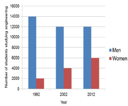
The bar chart shows the number of men and women studying eng...
Próximas questões
Com base no mesmo assunto
Ano: 2020
Banca:
IMT - SP
Órgão:
IMT - SP
Prova:
IMT - SP - 2020 - IMT - SP - 2ª Aplicação - 01/12/2020 |
Q1692771
Inglês
The bar chart shows the number of men and women studying engineering at Australian universities from 1992
and 2012 at 10-year intervals.
Which alternative shows the best summary of the graph?
Adapted from https://preply.com/en/blog/2018/08/17/charts-graphs-and-diagrams-in-the-presentation/
Which alternative shows the best summary of the graph?
Adapted from https://preply.com/en/blog/2018/08/17/charts-graphs-and-diagrams-in-the-presentation/