Questões de Concurso
Para analista de geoprocessamento
Foram encontradas 324 questões
Resolva questões gratuitamente!
Junte-se a mais de 4 milhões de concurseiros!
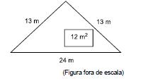
Nesse terreno será construído um pequeno aposento de 12 m², que ocupará, do terreno, uma área correspondente a
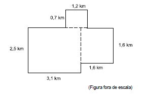
Um atleta que correu 3/4 do comprimento de uma volta desse circuito percorreu uma distância, em metros, igual a
Analise a charge.

(http://www.humorpolitico.com.br/wp-content/uploads/2015/04/charge-regi-0604.gif)
Considerando que as personagens se tratem por “você”, as lacunas da frase dita por Papai Noel devem ser preenchidas, de acordo com a norma-padrão da língua portuguesa, por:
Atenção: As questões de números 56 a 60 referem-se ao texto apresentado abaixo. As cores originais dos mapas 2, 3 e 4 foram
alteradas para visualização em tons de cinza.
Using analysis, we can feel confident in the spatial patterns we see, and in the decisions that we make.
Putting your data on a map is an important first step for finding patterns and understanding trends. Here we’re looking at crimes that happened in San Francisco, about 37,000 of them. Looking at the points on a map, can you find the clusters or patterns in this point data? Can you decide where the police department should allocate its resources? Just looking at points on a map is often not enough to answer questions or make decisions using this kind of point data. That’s where the spatial analysis tools in ArcGIS come in.

We’ve all seen heat maps on TV or in web application-beautiful maps that show high-density areas in bright red, and low-density
areas in blue. These maps are used to visualize crime, disease, and a whole host of other types of data and information. These heat
maps can be a great first step in a visual analysis of your data  they can also be very subjective. What does that mean? Well,
the two heat maps shown below reflect the same San Francisco Crime data, and were created using the same tool. The only difference
is the criteria that were used to decide what appears very dark (high density) and what appears very light (low density). These types of
cartographic elements that we incorporate into our maps can have a huge impact on the story that the map tells.
they can also be very subjective. What does that mean? Well,
the two heat maps shown below reflect the same San Francisco Crime data, and were created using the same tool. The only difference
is the criteria that were used to decide what appears very dark (high density) and what appears very light (low density). These types of
cartographic elements that we incorporate into our maps can have a huge impact on the story that the map tells.

If the decisions that you’re trying to make as a result of your analyses are important, and they usually are, you’ll want to
minimize subjectivity as much  . A great way to minimize the subjectivity in your pattern analysis is to use a hot spot analysis,
which incorporates a simple spatial statistic to determine if the patterns that you’re seeing are statistically significant or not. The hot
spot map is shown here.
. A great way to minimize the subjectivity in your pattern analysis is to use a hot spot analysis,
which incorporates a simple spatial statistic to determine if the patterns that you’re seeing are statistically significant or not. The hot
spot map is shown here.

So what makes this type of map any less subjective than density-based heat maps? The very dark areas on hot spot maps are statistically significant clusters of high values (hot spots), and the very light areas are statistically significant clusters of low values (cold spots). What’s dark and what’s light is always based on statistical significance. Using hot spot analysis, we can feel confident in the spatial patterns that we see, and in the decisions that we make.(Adapted from: http://resources.arcgis.com/en/communities/analysis/017z00000015000000.htm
Atenção: As questões de números 56 a 60 referem-se ao texto apresentado abaixo. As cores originais dos mapas 2, 3 e 4 foram
alteradas para visualização em tons de cinza.
Using analysis, we can feel confident in the spatial patterns we see, and in the decisions that we make.
Putting your data on a map is an important first step for finding patterns and understanding trends. Here we’re looking at crimes that happened in San Francisco, about 37,000 of them. Looking at the points on a map, can you find the clusters or patterns in this point data? Can you decide where the police department should allocate its resources? Just looking at points on a map is often not enough to answer questions or make decisions using this kind of point data. That’s where the spatial analysis tools in ArcGIS come in.
We’ve all seen heat maps on TV or in web application-beautiful maps that show high-density areas in bright red, and low-density
areas in blue. These maps are used to visualize crime, disease, and a whole host of other types of data and information. These heat
maps can be a great first step in a visual analysis of your data they can also be very subjective. What does that mean? Well,
the two heat maps shown below reflect the same San Francisco Crime data, and were created using the same tool. The only difference
is the criteria that were used to decide what appears very dark (high density) and what appears very light (low density). These types of
cartographic elements that we incorporate into our maps can have a huge impact on the story that the map tells.
If the decisions that you’re trying to make as a result of your analyses are important, and they usually are, you’ll want to
minimize subjectivity as much . A great way to minimize the subjectivity in your pattern analysis is to use a hot spot analysis,
which incorporates a simple spatial statistic to determine if the patterns that you’re seeing are statistically significant or not. The hot
spot map is shown here.
So what makes this type of map any less subjective than density-based heat maps? The very dark areas on hot spot maps are statistically significant clusters of high values (hot spots), and the very light areas are statistically significant clusters of low values (cold spots). What’s dark and what’s light is always based on statistical significance. Using hot spot analysis, we can feel confident in the spatial patterns that we see, and in the decisions that we make.(Adapted from: http://resources.arcgis.com/en/communities/analysis/017z00000015000000.htm
Completa o período, indicado pela lacuna II:
Atenção: As questões de números 56 a 60 referem-se ao texto apresentado abaixo. As cores originais dos mapas 2, 3 e 4 foram
alteradas para visualização em tons de cinza.
Using analysis, we can feel confident in the spatial patterns we see, and in the decisions that we make.
Putting your data on a map is an important first step for finding patterns and understanding trends. Here we’re looking at crimes that happened in San Francisco, about 37,000 of them. Looking at the points on a map, can you find the clusters or patterns in this point data? Can you decide where the police department should allocate its resources? Just looking at points on a map is often not enough to answer questions or make decisions using this kind of point data. That’s where the spatial analysis tools in ArcGIS come in.
We’ve all seen heat maps on TV or in web application-beautiful maps that show high-density areas in bright red, and low-density
areas in blue. These maps are used to visualize crime, disease, and a whole host of other types of data and information. These heat
maps can be a great first step in a visual analysis of your data they can also be very subjective. What does that mean? Well,
the two heat maps shown below reflect the same San Francisco Crime data, and were created using the same tool. The only difference
is the criteria that were used to decide what appears very dark (high density) and what appears very light (low density). These types of
cartographic elements that we incorporate into our maps can have a huge impact on the story that the map tells.
If the decisions that you’re trying to make as a result of your analyses are important, and they usually are, you’ll want to
minimize subjectivity as much . A great way to minimize the subjectivity in your pattern analysis is to use a hot spot analysis,
which incorporates a simple spatial statistic to determine if the patterns that you’re seeing are statistically significant or not. The hot
spot map is shown here.
So what makes this type of map any less subjective than density-based heat maps? The very dark areas on hot spot maps are statistically significant clusters of high values (hot spots), and the very light areas are statistically significant clusters of low values (cold spots). What’s dark and what’s light is always based on statistical significance. Using hot spot analysis, we can feel confident in the spatial patterns that we see, and in the decisions that we make.(Adapted from: http://resources.arcgis.com/en/communities/analysis/017z00000015000000.htm