Questões de Concurso Sobre inglês
Foram encontradas 25.431 questões


Text 4 to answer question.

Text 7 to answer question.
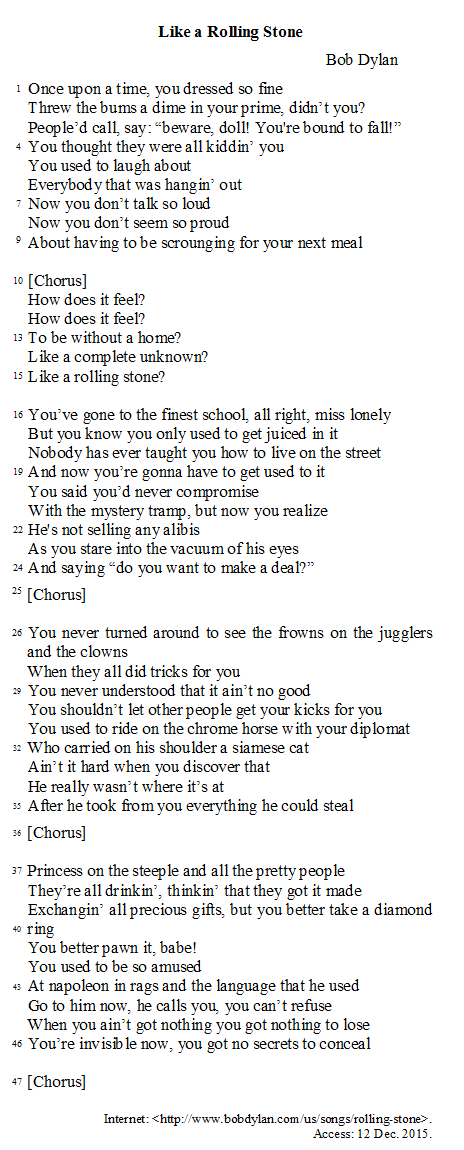
Text 7 to answer question.
Text 6 to answer question.

Internet: <http://joshuareich.org/2013/08/20/its-tuesday-afternoon-yourmotivation-is-low/>. Access: 12 Dec. 2015.
Text 6 to answer question.
Internet: <http://joshuareich.org/2013/08/20/its-tuesday-afternoon-yourmotivation-is-low/>. Access: 12 Dec. 2015.
Text 6 to answer question.
Internet: <http://joshuareich.org/2013/08/20/its-tuesday-afternoon-yourmotivation-is-low/>. Access: 12 Dec. 2015.
Text 6 to answer question.
Internet: <http://joshuareich.org/2013/08/20/its-tuesday-afternoon-yourmotivation-is-low/>. Access: 12 Dec. 2015.
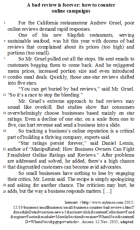
Atenção: A questão refere-se ao texto abaixo.
Subway and local train systems pose many of the same obstacles as airports for security professionals. Their efficacy relies on efficiency: People want to be able to get in and out as quickly as possible. But in both Delhi and Mumbai, subway lines often stretch out of the stations, as people patiently wait to put their bags through an X-ray machine and walk through a metal detector. Do citizens accept it because it’s always been that way? Or is the memory of the 2006 and 2008 attacks in Mumbai fresh enough that they are willing to take on the inconvenience, as long as it translates to safety? Programs like Global Entry and TSA PreCheck in the U.S. have been employed to increase the number of "known travelers" (and speed up the process when security risks are low), but recent news of a flight attendant who was part of TSA's Known Crewmember program − found with 70 pounds of cocaine in her carry-on − shows that no system is flawless.
Subways hold mass appeal because of their convenience, and it seems unlikely that the Delhi model could be replicated in other large public transit systems. Delhi has a daily ridership of about 2.3 million passengers, and the X-ray machines and metal detectors already act as a bottleneck to service. (New York, by comparison, has a daily ridership of about 6 million.) "Airport-style security in a train station or metro would be extremely cumbersome, given the much larger number of passengers using metro systems on a daily basis," says Matthew Finn, a London-based security specialist. Instead, he sees a different approach as a solution to metro security: "There are roles for other security layers, such as explosive detection canine units, real-time video analysis, behavioral analysis, and passive explosive trace detection systems."
(Adapted from http://www.cntraveler.com/stories/2016-03-25/brussels-attacks-expose-global-weaknesses-in-airport-subway-security)
Atenção: A questão refere-se ao texto abaixo.
Subway and local train systems pose many of the same obstacles as airports for security professionals. Their efficacy relies on efficiency: People want to be able to get in and out as quickly as possible. But in both Delhi and Mumbai, subway lines often stretch out of the stations, as people patiently wait to put their bags through an X-ray machine and walk through a metal detector. Do citizens accept it because it’s always been that way? Or is the memory of the 2006 and 2008 attacks in Mumbai fresh enough that they are willing to take on the inconvenience, as long as it translates to safety? Programs like Global Entry and TSA PreCheck in the U.S. have been employed to increase the number of "known travelers" (and speed up the process when security risks are low), but recent news of a flight attendant who was part of TSA's Known Crewmember program − found with 70 pounds of cocaine in her carry-on − shows that no system is flawless.
Subways hold mass appeal because of their convenience, and it seems unlikely that the Delhi model could be replicated in other large public transit systems. Delhi has a daily ridership of about 2.3 million passengers, and the X-ray machines and metal detectors already act as a bottleneck to service. (New York, by comparison, has a daily ridership of about 6 million.) "Airport-style security in a train station or metro would be extremely cumbersome, given the much larger number of passengers using metro systems on a daily basis," says Matthew Finn, a London-based security specialist. Instead, he sees a different approach as a solution to metro security: "There are roles for other security layers, such as explosive detection canine units, real-time video analysis, behavioral analysis, and passive explosive trace detection systems."
(Adapted from http://www.cntraveler.com/stories/2016-03-25/brussels-attacks-expose-global-weaknesses-in-airport-subway-security)
Atenção: A questão refere-se ao texto abaixo.
Judges Push Brevity in Briefs, and Get a Torrent of Arguments
By ELIZABETH OLSON
OCT. 3, 2016
The Constitution of the United States clocks in at 4,543 words. Yet a number of lawyers contend that 14,000 words are barely enough to lay out their legal arguments.
That’s the maximum word count for briefs filed in federal appellate courts. For years, judges have complained that too many briefs are repetitive and full of outmoded legal jargon, and that they take up too much of their time.
A recent proposal to bring the limit down by 1,500 words unleashed an outcry among lawyers.
Lawyers in criminal, environmental and securities law insisted that briefs’ lengths should not be shortened because legal issues and statutes are more complex than ever
As a result, the new word limit − which takes effect on Dec. 1 − will be 13,500 words, a reduction of only 500 words. And appellate judges will have the freedom to opt out of the limits.
The new limit may not provide much relief for judges deluged with verbose briefs.
While workloads vary, according to federal court data, the average federal appeals court judge, for example, might need to read filings for around 1,200 cases annually.
That amount of reading − especially bad reading − can thin the patience of even the most diligent judge.
Briefs “are too long to be persuasive,” said Laurence H. Silberman, a judge on the United States Court of Appeals for the District of Columbia Circuit
In arguing against a reduction of words, the American Academy of Appellate Lawyers urged singling out “bad briefs” rather than only lengthy ones. It advised courts to “post on their court websites short videos outlining how to write a decent brief.”
Robert N. Markle, a federal appellate lawyer, has argued − in his own personal view, not the government’s − that the limit should be reduced to 10,000 words. In a typical case, he said, “nothing justifies even approaching, much less reaching or exceeding 14,000 words.”
Still, he acknowledged that the cut of 500 words “was at least a start.”
(Adapted from http://www.nytimes.com/2016/10/04/business/dealbook/judges-push-brevity-in-briefs-and-get-a-torrent-of-arguments. html?_r=0)
Atenção: A questão refere-se ao texto abaixo.
Judges Push Brevity in Briefs, and Get a Torrent of Arguments
By ELIZABETH OLSON
OCT. 3, 2016
The Constitution of the United States clocks in at 4,543 words. Yet a number of lawyers contend that 14,000 words are barely enough to lay out their legal arguments.
That’s the maximum word count for briefs filed in federal appellate courts. For years, judges have complained that too many briefs are repetitive and full of outmoded legal jargon, and that they take up too much of their time.
A recent proposal to bring the limit down by 1,500 words unleashed an outcry among lawyers.
Lawyers in criminal, environmental and securities law insisted that briefs’ lengths should not be shortened because legal issues and statutes are more complex than ever
As a result, the new word limit − which takes effect on Dec. 1 − will be 13,500 words, a reduction of only 500 words. And appellate judges will have the freedom to opt out of the limits.
The new limit may not provide much relief for judges deluged with verbose briefs.
While workloads vary, according to federal court data, the average federal appeals court judge, for example, might need to read filings for around 1,200 cases annually.
That amount of reading − especially bad reading − can thin the patience of even the most diligent judge.
Briefs “are too long to be persuasive,” said Laurence H. Silberman, a judge on the United States Court of Appeals for the District of Columbia Circuit
In arguing against a reduction of words, the American Academy of Appellate Lawyers urged singling out “bad briefs” rather than only lengthy ones. It advised courts to “post on their court websites short videos outlining how to write a decent brief.”
Robert N. Markle, a federal appellate lawyer, has argued − in his own personal view, not the government’s − that the limit should be reduced to 10,000 words. In a typical case, he said, “nothing justifies even approaching, much less reaching or exceeding 14,000 words.”
Still, he acknowledged that the cut of 500 words “was at least a start.”
(Adapted from http://www.nytimes.com/2016/10/04/business/dealbook/judges-push-brevity-in-briefs-and-get-a-torrent-of-arguments. html?_r=0)
Atenção: A questão refere-se ao texto abaixo.
Judges Push Brevity in Briefs, and Get a Torrent of Arguments
By ELIZABETH OLSON
OCT. 3, 2016
The Constitution of the United States clocks in at 4,543 words. Yet a number of lawyers contend that 14,000 words are barely enough to lay out their legal arguments.
That’s the maximum word count for briefs filed in federal appellate courts. For years, judges have complained that too many briefs are repetitive and full of outmoded legal jargon, and that they take up too much of their time.
A recent proposal to bring the limit down by 1,500 words unleashed an outcry among lawyers.
Lawyers in criminal, environmental and securities law insisted that briefs’ lengths should not be shortened because legal issues and statutes are more complex than ever
As a result, the new word limit − which takes effect on Dec. 1 − will be 13,500 words, a reduction of only 500 words. And appellate judges will have the freedom to opt out of the limits.
The new limit may not provide much relief for judges deluged with verbose briefs.
While workloads vary, according to federal court data, the average federal appeals court judge, for example, might need to read filings for around 1,200 cases annually.
That amount of reading − especially bad reading − can thin the patience of even the most diligent judge.
Briefs “are too long to be persuasive,” said Laurence H. Silberman, a judge on the United States Court of Appeals for the District of Columbia Circuit
In arguing against a reduction of words, the American Academy of Appellate Lawyers urged singling out “bad briefs” rather than only lengthy ones. It advised courts to “post on their court websites short videos outlining how to write a decent brief.”
Robert N. Markle, a federal appellate lawyer, has argued − in his own personal view, not the government’s − that the limit should be reduced to 10,000 words. In a typical case, he said, “nothing justifies even approaching, much less reaching or exceeding 14,000 words.”
Still, he acknowledged that the cut of 500 words “was at least a start.”
(Adapted from http://www.nytimes.com/2016/10/04/business/dealbook/judges-push-brevity-in-briefs-and-get-a-torrent-of-arguments. html?_r=0)
Donald Trump on Monday proposed collapsing the federal income tax rate from seven brackets down to three and called for allowing child-care expenses to be exempt from taxation in a speech allies hope will help the GOP presidential nominee turn the page on a tumultuous period some Republicans fear has severely damaged his campaign.
Overall, Trump offered few new details behind his economic vision, which he unveiled as a candidate last year. One notable exception was his call to enable families to "fully deduct" child-care expenses from their taxes. Some such expenses are already deductible; experts say that the additional amounts will largely benefit middle- and upper middle-class families.
On tax rates, business mogul said he would work with House Republicans and use the same three brackets they have proposed: 12 percent, 25 percent and 33 percent. Previously, Trump proposed tax brackets of 0 percent, 10 percent, 20 percent and 25 percent.
"For many American workers, their tax rate will be zero," said Trump.
The GOP nominee continued to leave large question marks about how he would pay for his plans and avoid ballooning the federal budget deficit. He included no new details on how he would limit the cost of his tax reform plan, which analysts have estimated would reduce federal revenues by as much as $10 trillion over a decade. His child-care expense plan would presumably raise that cost even further.
Trump released a tax plan last year that would reduce the top income tax rate from 39.6 percent to 25 percent and bring down the top corporate rate from 35 percent to 15 percent. The plan would eliminate the estate tax and reduce tax rates to 10 percent for households earning $100,000 or less.
Trump also did not spell out any federal spending cuts. In his remarks, Trump said he would offer more details in the coming weeks.
(Adapted from https://www.washingtonpost.com/news/post-politics/wp/2016/08/08/trump-to-call-for-excluding-child-care-costs-from-taxation-as- hetries-to-turn-the-page-on-a-bruising-week/?wpisrc=nl_evening&wpmm=1)
Donald Trump on Monday proposed collapsing the federal income tax rate from seven brackets down to three and called for allowing child-care expenses to be exempt from taxation in a speech allies hope will help the GOP presidential nominee turn the page on a tumultuous period some Republicans fear has severely damaged his campaign.
Overall, Trump offered few new details behind his economic vision, which he unveiled as a candidate last year. One notable exception was his call to enable families to "fully deduct" child-care expenses from their taxes. Some such expenses are already deductible; experts say that the additional amounts will largely benefit middle- and upper middle-class families.
On tax rates, business mogul said he would work with House Republicans and use the same three brackets they have proposed: 12 percent, 25 percent and 33 percent. Previously, Trump proposed tax brackets of 0 percent, 10 percent, 20 percent and 25 percent.
"For many American workers, their tax rate will be zero," said Trump.
The GOP nominee continued to leave large question marks about how he would pay for his plans and avoid ballooning the federal budget deficit. He included no new details on how he would limit the cost of his tax reform plan, which analysts have estimated would reduce federal revenues by as much as $10 trillion over a decade. His child-care expense plan would presumably raise that cost even further.
Trump released a tax plan last year that would reduce the top income tax rate from 39.6 percent to 25 percent and bring down the top corporate rate from 35 percent to 15 percent. The plan would eliminate the estate tax and reduce tax rates to 10 percent for households earning $100,000 or less.
Trump also did not spell out any federal spending cuts. In his remarks, Trump said he would offer more details in the coming weeks.
(Adapted from https://www.washingtonpost.com/news/post-politics/wp/2016/08/08/trump-to-call-for-excluding-child-care-costs-from-taxation-as- hetries-to-turn-the-page-on-a-bruising-week/?wpisrc=nl_evening&wpmm=1)
Donald Trump on Monday proposed collapsing the federal income tax rate from seven brackets down to three and called for allowing child-care expenses to be exempt from taxation in a speech allies hope will help the GOP presidential nominee turn the page on a tumultuous period some Republicans fear has severely damaged his campaign.
Overall, Trump offered few new details behind his economic vision, which he unveiled as a candidate last year. One notable exception was his call to enable families to "fully deduct" child-care expenses from their taxes. Some such expenses are already deductible; experts say that the additional amounts will largely benefit middle- and upper middle-class families.
On tax rates, business mogul said he would work with House Republicans and use the same three brackets they have proposed: 12 percent, 25 percent and 33 percent. Previously, Trump proposed tax brackets of 0 percent, 10 percent, 20 percent and 25 percent.
"For many American workers, their tax rate will be zero," said Trump.
The GOP nominee continued to leave large question marks about how he would pay for his plans and avoid ballooning the federal budget deficit. He included no new details on how he would limit the cost of his tax reform plan, which analysts have estimated would reduce federal revenues by as much as $10 trillion over a decade. His child-care expense plan would presumably raise that cost even further.
Trump released a tax plan last year that would reduce the top income tax rate from 39.6 percent to 25 percent and bring down the top corporate rate from 35 percent to 15 percent. The plan would eliminate the estate tax and reduce tax rates to 10 percent for households earning $100,000 or less.
Trump also did not spell out any federal spending cuts. In his remarks, Trump said he would offer more details in the coming weeks.
(Adapted from https://www.washingtonpost.com/news/post-politics/wp/2016/08/08/trump-to-call-for-excluding-child-care-costs-from-taxation-as- hetries-to-turn-the-page-on-a-bruising-week/?wpisrc=nl_evening&wpmm=1)
Donald Trump on Monday proposed collapsing the federal income tax rate from seven brackets down to three and called for allowing child-care expenses to be exempt from taxation in a speech allies hope will help the GOP presidential nominee turn the page on a tumultuous period some Republicans fear has severely damaged his campaign.
Overall, Trump offered few new details behind his economic vision, which he unveiled as a candidate last year. One notable exception was his call to enable families to "fully deduct" child-care expenses from their taxes. Some such expenses are already deductible; experts say that the additional amounts will largely benefit middle- and upper middle-class families.
On tax rates, business mogul said he would work with House Republicans and use the same three brackets they have proposed: 12 percent, 25 percent and 33 percent. Previously, Trump proposed tax brackets of 0 percent, 10 percent, 20 percent and 25 percent.
"For many American workers, their tax rate will be zero," said Trump.
The GOP nominee continued to leave large question marks about how he would pay for his plans and avoid ballooning the federal budget deficit. He included no new details on how he would limit the cost of his tax reform plan, which analysts have estimated would reduce federal revenues by as much as $10 trillion over a decade. His child-care expense plan would presumably raise that cost even further.
Trump released a tax plan last year that would reduce the top income tax rate from 39.6 percent to 25 percent and bring down the top corporate rate from 35 percent to 15 percent. The plan would eliminate the estate tax and reduce tax rates to 10 percent for households earning $100,000 or less.
Trump also did not spell out any federal spending cuts. In his remarks, Trump said he would offer more details in the coming weeks.
(Adapted from https://www.washingtonpost.com/news/post-politics/wp/2016/08/08/trump-to-call-for-excluding-child-care-costs-from-taxation-as- hetries-to-turn-the-page-on-a-bruising-week/?wpisrc=nl_evening&wpmm=1)
 Conheça nossos planos